Nesquik Magazine Ad
Illustration, Editorial
The objective of this project is to design a two spread magazine ad for a product using an original product shot and a conceptual illustration.
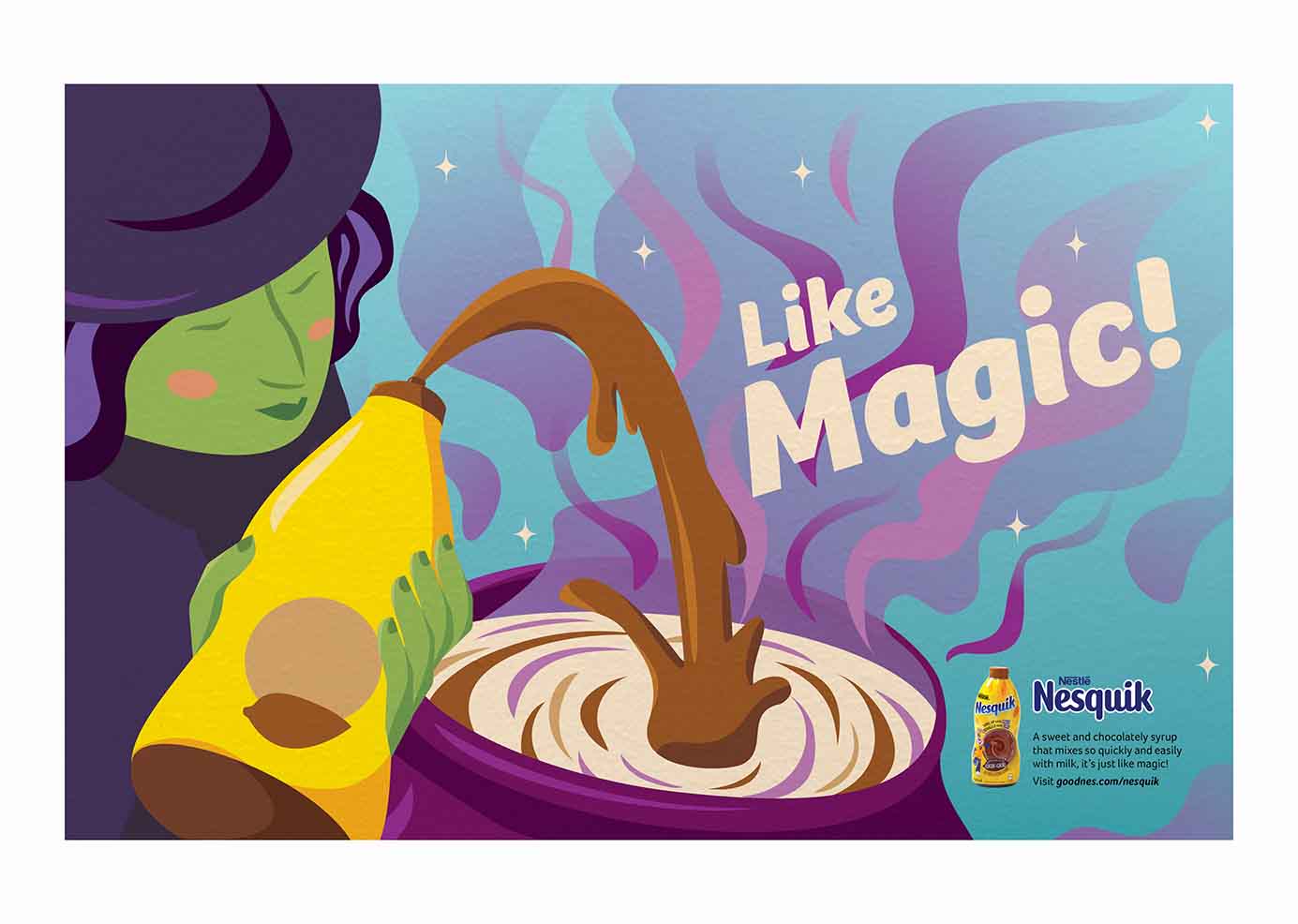
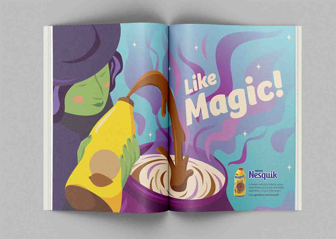
This design is for Nesquik chocolate syrup and utilizes the concept of magic to advertise the product's easy usability. The illustration style uses cell shading, bright analogous colours, texture, and rounded shapes to create a friendly and fun look that appeals to kids.


Process
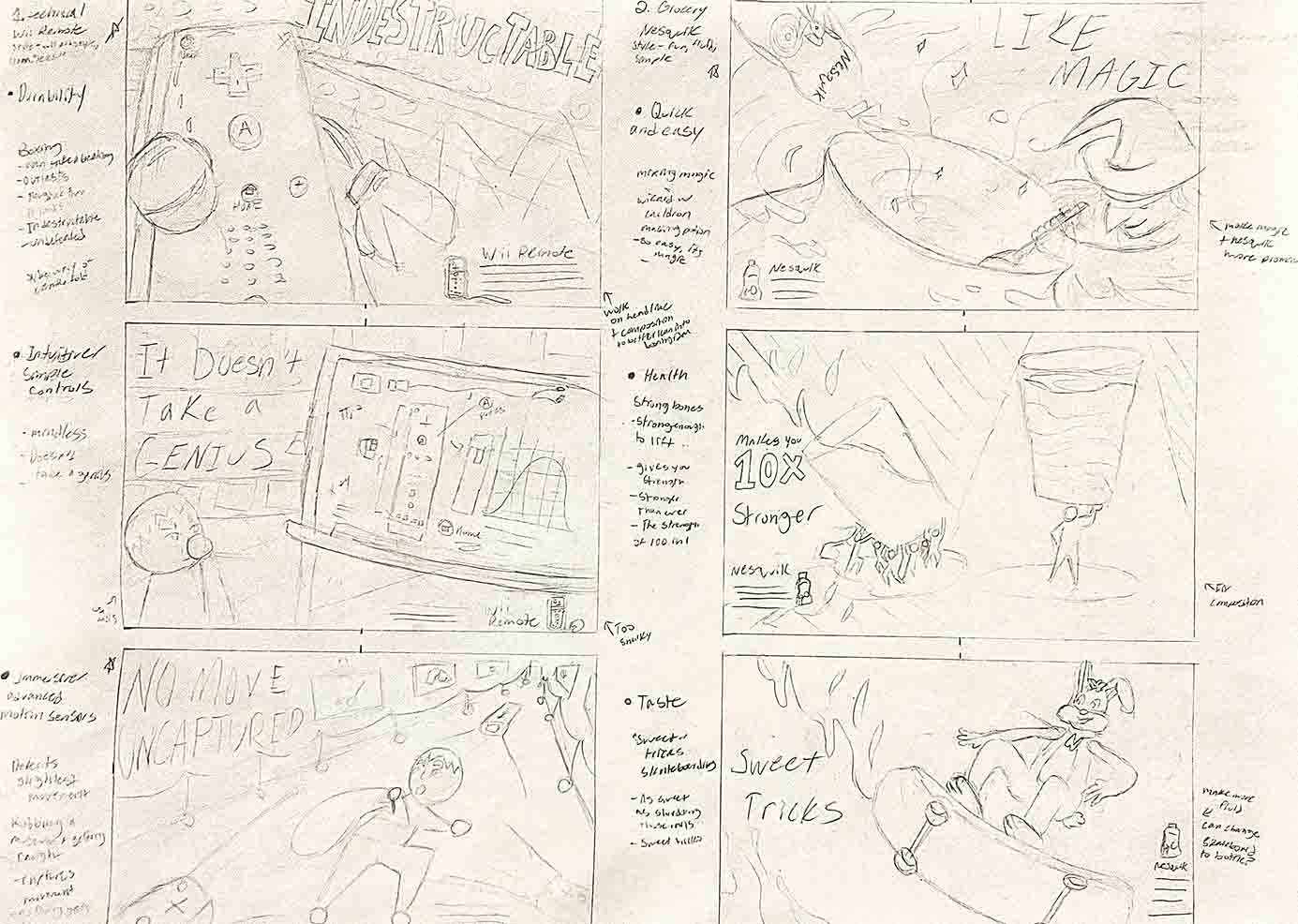
This project started with a series of concept thumbnails for different products based on the product benefits and visual metaphors.
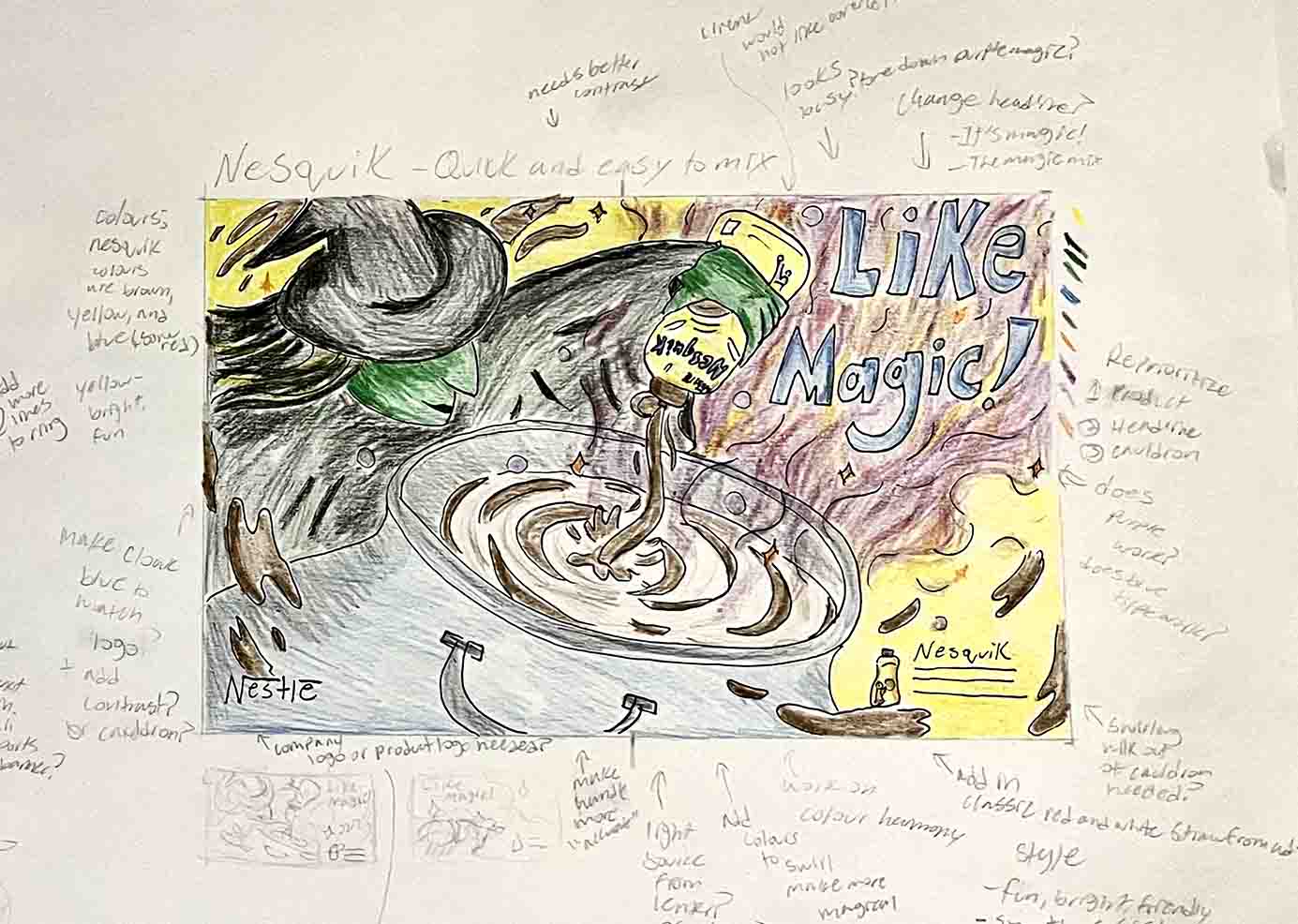
Then rough compostitons were made, testing various colours and layouts.
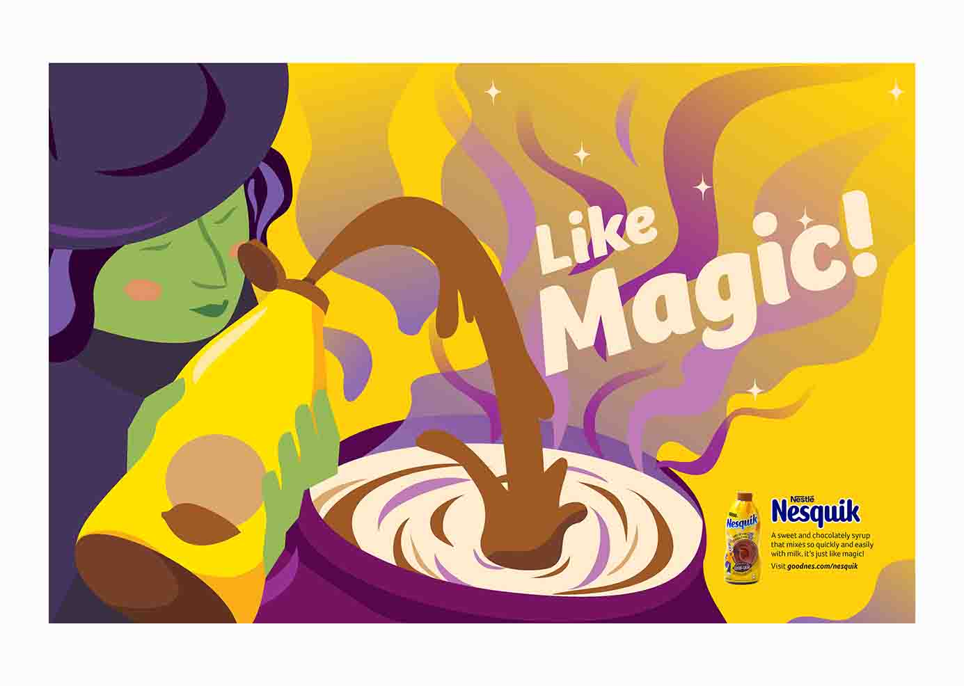
Final Design
The final product features a fun and friendly magazine ad that appeals to parents and kids.
A bumpy paper texture unites all elements of the illustration and the analogous colours blue and purple create harmony, while yellow adds contrast. The headline "Like Magic" creates a friendly and fluid look with a thick, round font.